

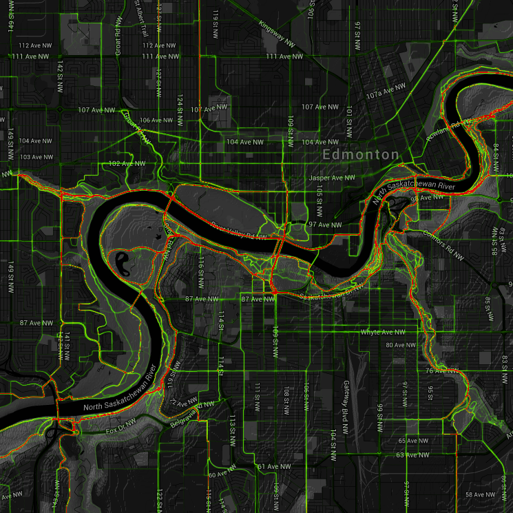
Here are two maps showing where people ride in Edmonton. The first is an interactive heatmap generated by Strava, a smartphone app. Strava compiles the maps using GPS data from app users who record their rides. As such, as a data source, it has limitations (the record is skewed towards the type of person that is more likely to record their rides using a smartphone app), but is still informative and very interesting:
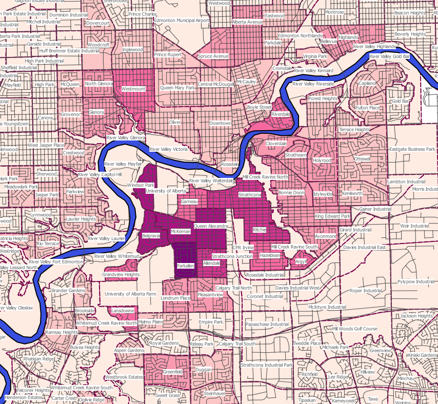
The second is a map we compiled using City of Edmonton 2014 census data. This data also has significant limitations, namely, the question asked is "Main Mode of Transportation from Home to Work". For many people, if they primarily bike for 5 months of the year, and then drive for 7 months, their answer will appear as "100% driver, 0% bicycle". Similarly for people who bike 2 days a week and drive 3 days: their cycling trips aren't represented at all in this data.
Additionally, most trips by bike are not for work (in the US, only about 13% of bike trips are for work), but our transportation network should still be accessible to everyone, regardless of the purpose of the trip. So census numbers greatly under-represent cycling. Still, they do offer a baseline for comparison between neighbourhoods.